使用vue+rem自定义轮播图的实现,供大家参考,具体内容如下
单位使用rem进行页面布局,在动态计算轮播图整体宽度时,需要把px转换成rem,挺麻烦的。
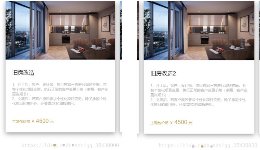
效果如下:如果当前图片不是第一张和最后一张,刚好可以看到当前图片上一张和下一张的一部分。
具体代码如下
<template>
    <div class="constructionUp">
        <div class="pub-hd">
            <h2>施工升级包</h2>
            <h3>额外服务项目</h3>
        </div>
        <div id="activityDiv">
            <ul num="0" id="activityUl">
               <li class="activityLi" v-for="(v,i) in listData" :key="i" @touchstart.capture="touchStart" @touchend.capture="touchEnd">
                    <img src="static/imgs/package/bitmap.jpg">
                    <div class="liText">
                        <p class="liTtitle">{{v.lititle}}</p>
                        <p class="liDes">1、开工后,客户、设计师、项目管家三方进行现场交底,若有个性化项目变更,执行正常的客户变更手续(参照:客户变更告知书);</p>
                        <p class="liDes">2、交底后,若客户原因要求个性化项目变更,除了承担个性化项目的费用外,还要增/次的调拨费用。</p>
                         <p class="liPrice">
                            <span class="title1">主题包价格:¥</span>
                            <span class="title2">4500</span>
                            <span class="title3">元</span>
                        </p>
                    </div>
                </li>
            </ul>
            <div class="pointerDiv">
                <span :class="[currantIndex ===0 ? 'active' : '', 'pointer']"></span>
                <span :class="[currantIndex ===1 ? 'active' : '', 'pointer']"></span>
                <span :class="[currantIndex ===2 ? 'active' : '', 'pointer']"></span>
            </div>
        </div>
    </div>
</template>

<script>
export default {
    data () {
        return {
            listData: [{lititle: '旧房改造'}, {lititle: '旧房改造2'}, {lititle: '旧房改造3'}],
            liWidth: 0,
            liNum: 0,
            startX: 0,
            endX: 0,
            currantIndex: 0,
            test: false

        }
    },
    mounted () {
        this.initUlWidth()
    },
    methods: {
        initUlWidth () { // 初始化 ul的宽度
            let pit = document.documentElement.clientWidth / 750 // 当前手机屏幕和750屏幕的比例
            let oldWidth = document.getElementsByClassName('activityLi')[0].offsetWidth // 单个li的宽度
            let marginR = getComputedStyle(document.getElementsByClassName('activityLi')[0], null)['marginRight'] // 获取单个的marginRight,带px
            let marginNum = parseInt(marginR.replace('px', ''))
            this.liWidth = oldWidth + marginNum // 单个宽度+maringRight
            let liCount = parseInt(document.getElementsByClassName('activityLi').length)// li的个数
            this.liNum = liCount
            let ULpx = oldWidth * liCount + (liCount - 1) * marginNum // 最后一个margin不算
            document.getElementById('activityUl').style.width = ULpx / pit + 'px'// 除以比率,让当前div宽度与2倍设计比例一样,设置ul的长度最后那个margin不算
        },
        touchStart (e) {
            // 记录初始位置
            e.preventDefault() // 阻止默认事件,滚动等
            this.startX = e.touches[0].clientX // 记录滑动开始的位置
        },
        touchEnd (e) {
            e.preventDefault() // 阻止默认事件
            // 记录结束位置
            this.endX = e.changedTouches[0].clientX
            // 左滑
            if (this.startX - this.endX > 30) {
                console.log('左滑')
                if (this.currantIndex >= this.liNum - 1) {
                    // 不做操作
                } else {
                    this.currantIndex++
                    document.getElementById('activityUl').style.left = -this.currantIndex * this.liWidth + 'px'
                }
            }
            // 右滑
            if (this.startX - this.endX < -30) {
                if (this.currantIndex === 0) {
                    // 不做操作
                } else {
                    this.currantIndex--
                    document.getElementById('activityUl').style.left = -this.currantIndex * this.liWidth + 'px'
                }
            }
            this.startX = 0
            this.endX = 0
        }

    }
}
</script>

<style lang="less" scoped>
    @import "~less/base.less";
    .constructionUp{
        width: 100%;
        .pub-hd{
            padding: 0.8rem 0 0.6rem 0;
            text-align: center;
            background-color: #ffffff;
            h2{
                font-size: 0.32rem;
                color: #606771;
            }
            h3{
                margin-top: 0.26rem;
                font-size: 0.24rem;
                color: #b9bec4;
            }
        }
        #activityDiv{
            padding-left: 0.4rem;
            background-color: #ffffff;
            overflow: hidden;
            #activityUl{
                position: relative;
                left: 0;
                height: 8.06rem;
                transition:all .35s ease-in-out;
                background-color: #ffffff;
                .activityLi{
                    float: left;
                    width: 6.7rem;
                    height: 8.06rem;
                    &:not(:last-child){
                        margin-right: 0.3rem;
                    }
                    box-shadow: 0 5px 25px 0 rgba(0,0,0,.4);
                    img{
                        width: 100%;
                        height: 3.6rem;
                    }
                    .liText{
                        padding: 0 0.4rem;
                        text-align: left;
                        .liTtitle{
                            padding: 0.48rem 0 0.36rem 0;
                            font-size: 0.34rem;
                            color: #000000;
                        }
                        .liDes{
                            font-size: 0.2rem;
                            color:#b5b5b5;
                        }
                    }
                    .liPrice{
                        height: 0.28rem;
                        line-height: 0.28rem;
                        color: @c-main; //颜色换一下就好
                        vertical-align: bottom;
                        margin-top: 0.8rem;
                        .title1{
                            display: inline-block;
                            font-size: 0.22rem;
                        }
                         .title2{
                              display: inline-block;
                              font-size: 0.35rem;
                        }
                         .title3{
                              display: inline-block;
                              font-size: 0.22rem;
                        }
                    }
                }
            }
             .pointerDiv{
                width: 100%;
                height: 1.54rem;
                background-color: #ffffff;
                display: flex;
                align-items: center;
                justify-content: center;
                .pointer{
                    display: inline-block;
                    width: 0.16rem;
                    height: 0.16rem;
                    background-color: #cccccc;
                    border-radius: 100%;
                    &:nth-child(2){
                        margin:0 0.4rem;
                    }
                    &.active{
                        background-color: @c-main;
                    }
                }
            }
        }
    }
</style>
关于vue.js组件的教程,请大家点击专题vue.js组件学习教程进行学习。
更多vue学习教程请阅读专题《vue实战教程》
以上就是本文的全部内容,希望对大家的学习有所帮助,也希望大家多多支持NICE源码。