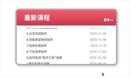
分享一个用原生JS实现的文字滚动效果,这种效果通常用在网页中一些局部展示信息,如新闻、动态、充值记录等,效果如下:
实现代码如下:
<!DOCTYPE html>
<html>

<head>
    <meta http-equiv="Content-Type" content="text/html; charset=utf-8" />
    <title>原生JS实现目录滚动特效</title>
    <style>
        body {
            font-size: 12px;
            line-height: 24px;
            text-align: center;
        }

        * {
            margin: 0px;
            padding: 0px;
        }

        ul {
            list-style: none;
        }

        a img {
            border: none;
        }

        a {
            color: #333;
            text-decoration: none;
        }

        a:hover {
            color: #ff0000;
        }

        #mooc {
            width: 399px;
            border: 5px solid #ababab;
            -moz-border-radius: 15px;
            -webkit-border-radius: 15px;
            border-radius: 15px;
            box-shadow: 2px 2px 10px #ababab;
            margin: 50px auto 0;
            text-align: left;
        }

        #moocTitle {
            height: 62px;
            overflow: hidden;
            font-size: 26px;
            line-height: 62px;
            padding-left: 30px;
            /* Firefox */
            background-image: -moz-linear-gradient(top, #f05e6f, #c9394a);
            /* Saf4+, Chrome */
            background-image: -webkit-gradient(linear, left top, left bottom, color-stop(0, #f05e6f), color-stop(1, #c9394a));
            /* IE*/
            filter: progid:DXImageTransform.Microsoft.gradient(startColorstr='#8fa1ff', endColorstr='#f05e6f', GradientType='0');
            border: 1px solid ##f05e6f;
            /* Gecko browsers */
            -moz-border-radius: 8px 8px 0 0;
            /* Webkit browsers */
            -webkit-border-radius: 8px 8px 0 0;
            border-radius: 8px 8px 0 0;
            color: #fff;
            position: relative;
        }

        #moocTitle a {
            position: absolute;
            right: 10px;
            bottom: 10px;
            display: inline;
            color: #fff;
            font-size: 12px;
            line-height: 24px;
        }

        #moocBot {
            width: 399px;
            height: 10px;
            overflow: hidden;
        }

        #moocBox {
            height: 144px;
            width: 335px;
            margin-left: 25px;
            margin-top: 10px;
            overflow: hidden;
        }

        #mooc ul li {
            height: 24px;
        }

        #mooc ul li a {
            width: 180px;
            float: left;
            display: block;
            overflow: hidden;
            text-indent: 15px;
            height: 24px;
        }

        #mooc ul li span {
            float: right;
            color: #999;
        }
    </style>
</head>

<body>
    <div id="mooc">
        <h3 id="moocTitle">
            最新课程<a href="#" rel="external nofollow"  rel="external nofollow"  rel="external nofollow"  rel="external nofollow"  rel="external nofollow"  rel="external nofollow"  rel="external nofollow"  rel="external nofollow"  rel="external nofollow"  rel="external nofollow"  target="_self">更多>></a>
        </h3>

        <div id="moocBox">
            <ul id="con1">
                <li>
                    <a href="#" rel="external nofollow"  rel="external nofollow"  rel="external nofollow"  rel="external nofollow"  rel="external nofollow"  rel="external nofollow"  rel="external nofollow"  rel="external nofollow"  rel="external nofollow"  rel="external nofollow"  >1.绝对的屌丝逆袭</a>
                    <span>2013-09-18</span>
                </li>
                <li>
                    <a href="#" rel="external nofollow"  rel="external nofollow"  rel="external nofollow"  rel="external nofollow"  rel="external nofollow"  rel="external nofollow"  rel="external nofollow"  rel="external nofollow"  rel="external nofollow"  rel="external nofollow"  >2.tab页面切换效果</a>
                    <span>2013-10-09</span>
                </li>
                <li>
                    <a href="#" rel="external nofollow"  rel="external nofollow"  rel="external nofollow"  rel="external nofollow"  rel="external nofollow"  rel="external nofollow"  rel="external nofollow"  rel="external nofollow"  rel="external nofollow"  rel="external nofollow"  >3.圆角水晶按钮制作</a>
                    <span>2013-10-21</span>
                </li>
                <li>
                    <a href="#" rel="external nofollow"  rel="external nofollow"  rel="external nofollow"  rel="external nofollow"  rel="external nofollow"  rel="external nofollow"  rel="external nofollow"  rel="external nofollow"  rel="external nofollow"  rel="external nofollow"  >4.HTML+CSS基础课程</a>
                    <span>2013-11-01</span>
                </li>
                <li>
                    <a href="#" rel="external nofollow"  rel="external nofollow"  rel="external nofollow"  rel="external nofollow"  rel="external nofollow"  rel="external nofollow"  rel="external nofollow"  rel="external nofollow"  rel="external nofollow"  rel="external nofollow"  >5.分页页码制作</a>
                    <span>2013-11-06</span>
                </li>
                <li>
                    <a href="#" rel="external nofollow"  rel="external nofollow"  rel="external nofollow"  rel="external nofollow"  rel="external nofollow"  rel="external nofollow"  rel="external nofollow"  rel="external nofollow"  rel="external nofollow"  rel="external nofollow"  >6.导航条菜单的制作</a>
                    <span>2013-11-08</span>
                </li>
                <li>
                    <a href="#" rel="external nofollow"  rel="external nofollow"  rel="external nofollow"  rel="external nofollow"  rel="external nofollow"  rel="external nofollow"  rel="external nofollow"  rel="external nofollow"  rel="external nofollow"  rel="external nofollow"  >7.信息列表制作</a>
                    <span>2013-11-15</span>
                </li>
                <li>
                    <a href="#" rel="external nofollow"  rel="external nofollow"  rel="external nofollow"  rel="external nofollow"  rel="external nofollow"  rel="external nofollow"  rel="external nofollow"  rel="external nofollow"  rel="external nofollow"  rel="external nofollow"  >8.下拉菜单制作</a>
                    <span>2013-11-22</span>
                </li>
                <li>
                    <a href="#" rel="external nofollow"  rel="external nofollow"  rel="external nofollow"  rel="external nofollow"  rel="external nofollow"  rel="external nofollow"  rel="external nofollow"  rel="external nofollow"  rel="external nofollow"  rel="external nofollow"  >9.如何实现“新手引导”效果</a>
                    <span>2013-12-06</span>
                </li>
            </ul>
            <ul id="con2"></ul>
        </div>
    </div>
    <script type="text/javascript">
        //获取滚动列表容器
        var area = document.getElementById('moocBox');
        //获取列表1
        var con1 = document.getElementById('con1');
        //获取空列表2
        var con2 = document.getElementById('con2');
        //设定定时器执行时间间隔
        var speed = 50;

        //设定向上滚动变量
        area.scrollTop = 0;

        //复制列表1的内容给列表2
        con2.innerHTML = con1.innerHTML;

        //向上滚动函数
        function scrollUp() {
            //当滚动列表向滚动的高度大于等于列表自身的高度时
            if (area.scrollTop >= con1.scrollHeight) {
                //将列表滚动高度归零,重新开始滚
                area.scrollTop = 0;
                //否则
            } else {
                //继续滚
                area.scrollTop++;
            }
        }

        //存储定时器
        var myScroll = setInterval("scrollUp()", speed);

        //当鼠标移入的时候,清除定时器
        area.onmouseover = function () {
            clearInterval(myScroll);
        }
        //当鼠标移开的时候,启动定时器
        area.onmouseout = function () {
            myScroll = setInterval("scrollUp()", speed);
        }
    </script>
</body>

</html>
以上就是本文的全部内容,希望对大家的学习有所帮助,也希望大家多多支持NICE源码。