本文实例为大家分享了小程序自定义tabBar组件封装的具体代码,供大家参考,具体内容如下
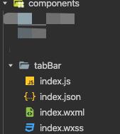
1、新建组件:在component下新建一个tabBar
2、组件的index.wxml结构如下:
<cover-view class="tab-bar">
 <cover-view class="tab-bar-border"></cover-view>
 <cover-view wx:for="{{list}}" wx:key="index" class="tab-bar-item" data-path="{{item.pagePath}}" data-index="{{index}}" bindtap="tabChange">
  <cover-image src="{{tabbarIndex%20===%20index%20?%20item.selectedIconPath%20:%20item.iconPath}}"></cover-image>
  <cover-view style="color: {{tabbarIndex === index ? selectedColor : color}}">{{item.text}}</cover-view>
 </cover-view>
</cover-view>
3、组件的index.wxss结构如下:
.tab-bar {
  position: fixed;
  bottom: 0;
  left: 0;
  right: 0;
  height: 60px;
  background: white;
  display: flex;
  padding-bottom: env(safe-area-inset-bottom);
}

.tab-bar-border {
  background-color: rgba(0, 0, 0, 0.33);
  position: absolute;
  left: 0;
  top: 0;
  width: 100%;
  height: 1px;
  transform: scaleY(0.5);
}

.tab-bar-item {
  flex: 1;
  text-align: center;
  display: flex;
  justify-content: center;
  align-items: center;
  flex-direction: column;
}

.tab-bar-item cover-image {
  width: 28px;
  height: 28px;
  margin-bottom: 2px;
}

.tab-bar-item cover-view {
  font-size: 10px;
}
4、组件的index.js结构如下:
// pages/components/tabBar/index.js
Component({
  /**
 1. 组件的属性列表
   */
  options: {
    multipleSlots: true //在组件定义时的选项中启用多slot支持
  },
  properties: {
    list: {
      type: Array,
      value: []
    },
    selectedColor:{
      type: String,
      value:''
    },
    color:{
      type: String,
      value:''
    },
  },

  /**
 2. 组件的初始数据
   */
  data: {
    tabbarIndex: 0//默认显示第一个tab元素
  },

  lifetimes: {
    attached() {}
  },

  /**
 3. 组件的方法列表
   */
  methods: {
    //组件的点击事件
    tabChange(e) {
      //获取到底部栏元素的下标
      let index = e.currentTarget.dataset.index;
      this.setData({
        tabbarIndex:index,
      })
      //triggerEvent获取组件的事件
      //onMyEvent 页面传过来的点击事件名称
      this.triggerEvent('onMyEvent',{
        tabbarIndex:index,
      })
    },
  }
})
5、组件的index.json结构如下:
{
  "component": true,
  "usingComponents": {}
}
6、组件在页面中的使用
7、页面的json代码如下:
{
  "navigationBarTitleText": "测试",
  "usingComponents": {
    "mp-tabbar": "../components/tabBar/index"
  }
}
8、页面的wxml代码如下:
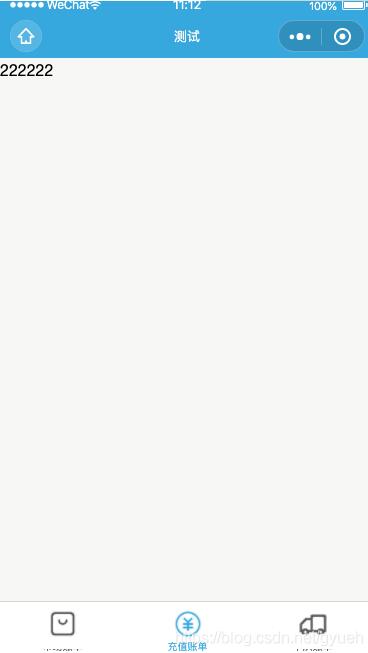
//当选中tab1时页面显示的内容
<view wx:if="{{tabbarIndex == 0}}">111111</view>
//当选中tab2时页面显示的内容
<view wx:if="{{tabbarIndex == 1}}">222222</view>
//当选中tab3时页面显示的内容
<view wx:if="{{tabbarIndex == 2}}">333333</view>
<mp-tabbar list="{{list}}" id='tabComponent' bind:onMyEvent="tabChange"></mp-tabbar>
9、页面的js代码如下:
Page({
  data: {
    tabbarIndex:0,//默认第一个tab元素
    color: "#555555",
    selectedColor: "#2ea7e0",
    //底部栏
    list: [{
        "text": "市场",
        "iconPath": "/images/bazaar.png",
        "selectedIconPath": "/images/bazaar_selected.png",
      },
      {
        "text": "充值",
        "iconPath": "/images/recharge.png",
        "selectedIconPath": "/images/recharge_selected.png",
      }, {
        "text": "车队",
        "iconPath": "/images/market.png",
        "selectedIconPath": "/images/market_selected.png",
      }
    ]
  },
  /**
   * 生命周期函数--监听页面显示
   */
  onShow: function () {
    this.tabComponent = this.selectComponent('#tabComponent');
    let selectedColor = this.data.selectedColor;
    let color = this.data.color;
    this.tabComponent.setData({
      selectedColor: selectedColor,
      color:color
   })
   console.log(this.tabComponent.data.tabbarIndex)
  },
  //获取组件传递出来的数据
  tabChange:function(e){
    let index = e.detail.tabbarIndex;
    this.setData({
      tabbarIndex:index
    })
    console.log(e.detail.tabbarIndex)
  }
})
最终效果如图所示:
以上就是本文的全部内容,希望对大家的学习有所帮助,也希望大家多多支持NICE源码。