先贴效果图:
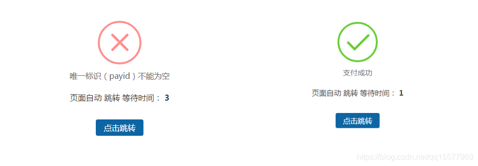
优点:图标是有动画效果的,不需要背景图片。
1、需要引用一个dialog.css,代码如下:
/* ===========================================
 @des:     dialog.less
 @author:   美奇软件开发工作室
 @QQ:     15577969
 @赞助平台:  元宝支付(18pay.net)
 @time:    2021-01-10
 =============================================*/

@charset "utf-8";
.clearfix {
 *zoom: 1;
}
.clearfix:after {
 visibility: hidden;
 display: block;
 font-size: 0;
 content: " ";
 clear: both;
 height: 0;
}
* {
 margin: 0;
 padding: 0;
}
ul,
ol {
 list-style: none;
}
img {
 border: none;
}
input,
select,
textarea {
 outline: none;
 border: none;
 background: none;
}
textarea {
 resize: none;
}
a {
 text-decoration: none;
}
.body {
 font-family: 14px "Microsoft Yahei", "微软雅黑", Arial, Tahoma;
}
.btn-container {
 width: 100%;
 display: flex;
 display: -webkit-flex;
 display: -moz-flex;
 justify-content: space-around;
 -webkit-justify-content: space-around;
 -moz-justify-content: space-around;
}
.btn-container input[type='button'] {
 width: 20%;
 padding: 0.357rem;
 color: #fff;
 border-radius: 3px;
 -webkit-radius: 3px;
 -moz-radius: 3px;
 background-color: #3B9DFF;
}
.btn-container input[type='button']:active {
 background-color: #1966b3;
}
/*重置盒模型 */
.boxContent * {
 box-sizing: content-box;
 -webkit-box-sizing: content-box;
 -moz-box-sizing: content-box;
}
/*animation start*/
#animationTipBox {
 width: 100%;
 height: auto;
 background-color: #fff;
 border-radius: 8px;
 -webkit-border-radius: 8px;
 -moz-border-radius: 8px;
 position: fixed;
 left: 50%;
 top: 30%;
 margin-left: -50%;
 margin-top: -75px;
 z-index: 1001;
 -webkit-animation: alertAnimation 0.3s ease-in-out 0s 1;
 -moz-animation: alertAnimation 0.3s ease-in-out 0s 1;
 animation: alertAnimation 0.3s ease-in-out 0s 1;
}
#animationTipBox * {
 box-sizing: content-box;
 -webkit-box-sizing: content-box;
 -moz-box-sizing: content-box;
}
#animationTipBox .icon {
 position: relative;
 width: 80px;
 height: 80px;
 border-radius: 50px;
 -webkit-border-radius: 50px;
 -moz-border-radius: 50px;
 border: 4px solid #66cc33;
 margin: 15px auto 5px auto;
}
#animationTipBox .icon_box {
 width: 80px;
 height: 80px;
 margin: 0 auto;
 text-align: center;
 position: relative;
}
#animationTipBox .lose .icon {
 border-color: #FF9090;
}
#animationTipBox .lose .icon_box {
 -webkit-animation: lose_Animation 0.5s ease 0s 1;
 -moz-animation: lose_Animation 0.5s ease 0s 1;
 animation: lose_Animation 0.5s ease 0s 1;
}
#animationTipBox .dec_txt {
 font-size: 16px;
 text-align: center;
 color: #666;
 line-height: 26px;
 height: 26px;
 padding: 5px 0 10px 0;
}
.tip .icon {
 width: 80px;
 height: 80px;
 background-color: #66cc33;
 border-radius: 100%;
 -webkit-border-radius: 100%;
 -moz-border-radius: 100%;
 color: #fff;
 font-size: 80px;
 text-align: center;
 line-height: 80px;
}
.success .line_short {
 width: 25px;
 height: 5px;
 position: absolute;
 left: 14px;
 top: 46px;
 border-radius: 4px;
 -webkit-border-radius: 4px;
 -moz-border-radius: 4px;
 background-color: #66cc33;
 transform: rotate(45deg);
 -webkit-transform: rotate(45deg);
 -moz-transform: rotate(45deg);
 -webkit-animation: success_short_Animation 0.65s ease 0s 1;
 -moz-animation: success_short_Animation 0.65s ease 0s 1;
 animation: success_short_Animation 0.65s ease 0s 1;
}
.success .line_long {
 width: 47px;
 height: 5px;
 position: absolute;
 right: 8px;
 top: 38px;
 border-radius: 4px;
 -webkit-border-radius: 4px;
 -moz-border-radius: 4px;
 background-color: #66cc33;
 transform: rotate(-45deg);
 -webkit-transform: rotate(-45deg);
 -moz-transform: rotate(-45deg);
 -webkit-animation: success_long_Animation 0.65s ease 0s 1;
 -moz-animation: success_long_Animation 0.65s ease 0s 1;
 animation: success_long_Animation 0.65s ease 0s 1;
}
.lose .line_left,
.lose .line_right {
 width: 47px;
 height: 5px;
 position: absolute;
 left: 17px;
 top: 37px;
 border-radius: 4px;
 -webkit-border-radius: 4px;
 -moz-border-radius: 4px;
 background-color: #FF9090;
 transform: rotate(45deg);
 -webkit-transform: rotate(45deg);
 -moz-transform: rotate(45deg);
}
.lose .line_right {
 right: 11px;
 top: 37px;
 transform: rotate(-45deg);
 -webkit-transform: rotate(-45deg);
 -moz-transform: rotate(-45deg);
}
/* 总体动画 函数 */
/*all animate*/
@-webkit-keyframes alertAnimation {
 0% {
  -webkit-transform: scale(0.5);
 }
 45% {
  -webkit-transform: scale(1.25);
 }
 80% {
  -webkit-transform: scale(0.95);
 }
 100% {
  -webkit-transform: scale(1);
 }
}
@-moz-keyframes alertAnimation {
 0% {
  -webkit-transform: scale(0.5);
 }
 45% {
  -webkit-transform: scale(1.25);
 }
 80% {
  -webkit-transform: scale(0.95);
 }
 100% {
  -webkit-transform: scale(1);
 }
}
@-webkit-keyframes alertAnimation {
 0% {
  -webkit-transform: scale(0.5);
 }
 45% {
  -webkit-transform: scale(1.25);
 }
 80% {
  -webkit-transform: scale(0.95);
 }
 100% {
  -webkit-transform: scale(1);
 }
}
/*all animate*/
/*success short animate*/
@-webkit-keyframes success_short_Animation {
 0% {
  width: 0;
  left: 1px;
  top: 19px;
 }
 54% {
  width: 0;
  left: 1px;
  top: 19px;
 }
 70% {
  width: 50px;
  left: -4px;
  top: 37px;
 }
 84% {
  width: 17px;
  left: 21px;
  top: 48px;
 }
 100% {
  width: 25px;
  left: 14px;
  top: 45px;
 }
}
@-moz-keyframes success_short_Animation {
 0% {
  width: 0;
  left: 1px;
  top: 19px;
 }
 54% {
  width: 0;
  left: 1px;
  top: 19px;
 }
 70% {
  width: 50px;
  left: -4px;
  top: 37px;
 }
 84% {
  width: 17px;
  left: 21px;
  top: 48px;
 }
 100% {
  width: 25px;
  left: 14px;
  top: 45px;
 }
}
@-webkit-keyframes success_short_Animation {
 0% {
  width: 0;
  left: 1px;
  top: 19px;
 }
 54% {
  width: 0;
  left: 1px;
  top: 19px;
 }
 70% {
  width: 50px;
  left: -4px;
  top: 37px;
 }
 84% {
  width: 17px;
  left: 21px;
  top: 48px;
 }
 100% {
  width: 25px;
  left: 14px;
  top: 45px;
 }
}
/*success short animate*/
/*success long animate*/
@-webkit-keyframes success_long_Animation {
 0% {
  width: 0;
  right: 46px;
  top: 54px;
 }
 65% {
  width: 0;
  right: 46px;
  top: 54px;
 }
 84% {
  width: 55px;
  right: 0px;
  top: 35px;
 }
 100% {
  width: 47px;
  right: 8px;
  top: 38px;
 }
}
@-moz-keyframes success_long_Animation {
 0% {
  width: 0;
  right: 46px;
  top: 54px;
 }
 65% {
  width: 0;
  right: 46px;
  top: 54px;
 }
 84% {
  width: 55px;
  right: 0px;
  top: 35px;
 }
 100% {
  width: 47px;
  right: 8px;
  top: 38px;
 }
}
@-webkit-keyframes success_long_Animation {
 0% {
  width: 0;
  right: 46px;
  top: 54px;
 }
 65% {
  width: 0;
  right: 46px;
  top: 54px;
 }
 84% {
  width: 55px;
  right: 0px;
  top: 35px;
 }
 100% {
  width: 47px;
  right: 8px;
  top: 38px;
 }
}
/*success long animate*/
/*load_Animation*/
@-webkit-keyframes load_Animation {
 0% {
  -webkit-transform: scale(0.6);
  opacity: 0.2;
 }
 50% {
  -webkit-transform: scale(0.6);
  opacity: 0.5;
 }
 80% {
  -webkit-transform: scale(1.15);
  opacity: 0.8;
 }
 100% {
  -webkit-transform: scale(1);
  opacity: 1.0;
 }
}
@-moz-keyframes load_Animation {
 0% {
  -webkit-transform: scale(0.6);
  opacity: 0.2;
 }
 50% {
  -webkit-transform: scale(0.6);
  opacity: 0.5;
 }
 80% {
  -webkit-transform: scale(1.15);
  opacity: 0.8;
 }
 100% {
  -webkit-transform: scale(1);
  opacity: 1.0;
 }
}
@-webkit-keyframes load_Animation {
 0% {
  -webkit-transform: scale(0.6);
  opacity: 0.2;
 }
 50% {
  -webkit-transform: scale(0.6);
  opacity: 0.5;
 }
 80% {
  -webkit-transform: scale(1.15);
  opacity: 0.8;
 }
 100% {
  -webkit-transform: scale(1);
  opacity: 1.0;
 }
}
/*load_Animation*/
/*lose_Animation*/
@-webkit-keyframes lose_Animation {
 0% {
  -webkit-transform: scale(0.6);
  opacity: 0.2;
 }
 50% {
  -webkit-transform: scale(0.6);
  opacity: 0.5;
 }
 80% {
  -webkit-transform: scale(1.15);
  opacity: 0.8;
 }
 100% {
  -webkit-transform: scale(1);
  opacity: 1.0;
 }
}
@-moz-keyframes lose_Animation {
 0% {
  -webkit-transform: scale(0.6);
  opacity: 0.2;
 }
 50% {
  -webkit-transform: scale(0.6);
  opacity: 0.5;
 }
 80% {
  -webkit-transform: scale(1.15);
  opacity: 0.8;
 }
 100% {
  -webkit-transform: scale(1);
  opacity: 1.0;
 }
}
@-webkit-keyframes lose_Animation {
 0% {
  -webkit-transform: scale(0.6);
  opacity: 0.2;
 }
 50% {
  -webkit-transform: scale(0.6);
  opacity: 0.5;
 }
 80% {
  -webkit-transform: scale(1.15);
  opacity: 0.8;
 }
 100% {
  -webkit-transform: scale(1);
  opacity: 1.0;
 }
}
/*lose_Animation*/
.load {
 position: relative;
 width: 60px;
 height: 80px;
 border-radius: 50px;
 -webkit-border-radius: 50px;
 -moz-border-radius: 50px;
 border: 4px solid #fff;
 margin: 15px auto 5px auto;
 top: 10px;
}
.load .icon_box {
 margin: 10px auto;
 width: 60px;
 height: 60px;
}
.load .cirBox1,
.load .cirBox2,
.load .cirBox3 {
 width: 60px;
 height: 60px;
 position: absolute;
 left: 0;
 top: 0;
}
.load .cirBox1 > div,
.load .cirBox2 > div,
.load .cirBox3 > div {
 width: 10px;
 height: 10px;
 border-radius: 100%;
 -webkit-border-radius: 100%;
 -moz-border-radius: 100%;
 background-color: #ccc;
 position: absolute;
}
.load .cirBox1 {
 transform: rotate(30deg);
 -webkit-transform: rotate(30deg);
 -moz-transform: rotate(30deg);
}
.load .cirBox2 {
 transform: rotate(60deg);
 -webkit-transform: rotate(60deg);
 -moz-transform: rotate(60deg);
}
.load .cirBox3 {
 transform: rotate(90deg);
 -webkit-transform: rotate(90deg);
 -moz-transform: rotate(90deg);
}
.load .cir1 {
 left: 0;
 top: 0;
}
.load .cir2 {
 right: 0;
 top: 0;
}
.load .cir3 {
 right: 0;
 bottom: 0;
}
.load .cir4 {
 left: 0;
 bottom: 0;
}
.load .cir1,
.load .cir2,
.load .cir3,
.load .cir4 {
 -webkit-animation: cir_Animation 1.2s ease 0s infinite;
 -moz-animation: cir_Animation 1.2s ease 0s infinite;
 animation: cir_Animation 1.2s ease 0s infinite;
}
.cirBox1 .cir2 {
 -webkit-animation-delay: -1.1s;
 -moz-animation-delay: -1.1s;
 animation-delay: -1.1s;
}
.cirBox1 .cir3 {
 -webkit-animation-delay: -0.8s;
 -moz-animation-delay: -0.8s;
 animation-delay: -0.8s;
}
.cirBox1 .cir4 {
 -webkit-animation-delay: -0.5s;
 -moz-animation-delay: -0.5s;
 animation-delay: -0.5s;
}
.cirBox2 .cir2 {
 -webkit-animation-delay: -1s;
 -moz-animation-delay: -1s;
 animation-delay: -1s;
}
.cirBox2 .cir3 {
 -webkit-animation-delay: -0.7s;
 -moz-animation-delay: -0.7s;
 animation-delay: -0.7s;
}
.cirBox2 .cir4 {
 -webkit-animation-delay: -0.4s;
 -moz-animation-delay: -0.4s;
 animation-delay: -0.4s;
}
.cirBox3 .cir2 {
 -webkit-animation-delay: -0.9s;
 -moz-animation-delay: -0.9s;
 animation-delay: -0.9s;
}
.cirBox3 .cir3 {
 -webkit-animation-delay: -0.6s;
 -moz-animation-delay: -0.6s;
 animation-delay: -0.6s;
}
.cirBox3 .cir4 {
 -webkit-animation-delay: -0.3s;
 -moz-animation-delay: -0.3s;
 animation-delay: -0.3s;
}
@-webkit-keyframes cir_Animation {
 0%,
 80%,
 100% {
  -webkit-transform: scale(0.4);
 }
 40% {
  -webkit-transform: scale(1);
 }
}
@-moz-keyframes cir_Animation {
 0%,
 80%,
 100% {
  -webkit-transform: scale(0.4);
 }
 40% {
  -webkit-transform: scale(1);
 }
}
@-webkit-keyframes cir_Animation {
 0%,
 80%,
 100% {
  -webkit-transform: scale(0.4);
 }
 40% {
  -webkit-transform: scale(1);
 }
}
.mask {
 width: 100%;
 height: 100%;
 background-color: #000;
 opacity: .8;
 position: fixed;
 left: 0;
 top: 0;
 z-index: 1000;
}
2、修改application/config.php里,默认跳转页面对应的模板文件
// 视图输出字符串内容替换
'view_replace_str'    => ['__STATIC__'=>'/static'],
// 默认跳转页面对应的模板文件
//'dispatch_success_tmpl' => THINK_PATH . 'tpl' . DS . 'dispatch_jump.tpl',
//'dispatch_error_tmpl'  => THINK_PATH . 'tpl' . DS . 'dispatch_jump.tpl',
'dispatch_success_tmpl' => THINK_PATH . 'tpl' . DS .'default_jump.tpl',
'dispatch_error_tmpl'  => THINK_PATH . 'tpl' . DS .'default_jump.tpl',
3、在thinkphp/tpl目录下新建一个default_jump.tpl,代码如下:
{__NOLAYOUT__}<!DOCTYPE html PUBLIC "-//W3C//DTD XHTML 1.0 Transitional//EN" "http://www.w3.org/TR/xhtml1/DTD/xhtml1-transitional.dtd">
<html xmlns="http://www.w3.org/1999/xhtml">
<head>
  <meta http-equiv="Content-Type" content="text/html; charset=utf-8" />
  <meta name="viewport" content="width=device-width,initial-scale=1.0,minimum-scale=1.0,maximum-scale=1.0,user-scalable=no"/>
  <title>跳转提示</title>
	<!--引入dialog.css样式-->
  <link rel="stylesheet" href="__STATIC__/css/dialog.css" rel="external nofollow"  rel="external nofollow" >
  <style type="text/css">
		.system-message p{ text-align: center;}
		.system-message .jump{ padding-top: 10px}
		.system-message .jump a{ color: #333;}
		.system-message .jump-btn{margin-top: 40px}
		.system-message .jump-btn a{font-size: 16px;color: #fff;border-radius: 4px;background-color: #0d65a3;padding: 6px 16px;text-decoration: none;}
	</style>
</head>
<body>
  <div class="system-message">
		<div id='animationTipBox'>
    <?php switch ($code) {?>
      <?php case 1:?>
			<!--成功-->
				<div class='success'>
				  <div class='icon'>
					  <div class='icon_box'>
						  <div class='line_short'></div>
						  <div class='line_long'></div>
					  </div>
				  </div>
					<div class='dec_txt'><?php echo(strip_tags($msg));?></div>
				</div>
      <?php break;?>
      <?php case 0:?>
			<!--错误-->
				<div class='lose'>
				  <div class='icon'>
					  <div class='icon_box'>
						  <div class='line_left'></div>
						  <div class='line_right'></div>
					  </div>
				  </div>
					<div class='dec_txt'><?php echo(strip_tags($msg));?></div>
				</div>
      <?php break;?>
    <?php } ?>
			<p class="jump">
				页面自动<a id="href" href="<?php%20echo($url);?>" rel="external nofollow"  rel="external nofollow" >跳转</a> 等待时间: <b id="wait"><?php echo($wait);?></b>
			</p>
			<p class="jump-btn"><a id="href" href="<?php%20echo($url);%20?>" rel="external nofollow"  rel="external nofollow" >点击跳转</a></p>
		</div>
  </div>
  <script type="text/javascript">
    (function(){
      var wait = document.getElementById('wait'),
        href = document.getElementById('href').href;
      var interval = setInterval(function(){
        var time = --wait.innerHTML;
        if(time <= 0) {
          location.href = href;
          clearInterval(interval);
        };
      }, 1000);
    })();
  </script>
</body>
</html>
注意:dialog.css的路径要根据你自己的网站来写
到此这篇关于Thinkphp自定义美化success和error提示跳转页面代码实例的文章就介绍到这了,更多相关Thinkphp自定义美化success和error提示跳转页面内容请搜索NICE源码以前的文章或继续浏览下面的相关文章希望大家以后多多支持NICE源码!